Wearable Wellness Tracking
A WearOS smartwatch application for mental health awareness with mood, medication, and break tracking features.
Project Summary
This project examines the prototyping and user testing process including: wireframes, user flows, interaction design, asset design, and interactive high fidelity prototypes.
This was an individual project for my academic studies, all work is my own.
Challenge & Goal
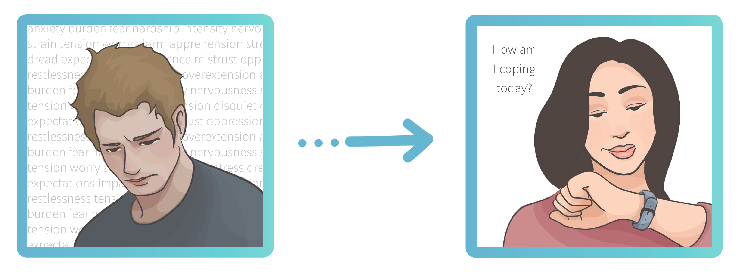
Self-care is too often de-prioritised, this is particularly so when considering mental health. Sometimes it seems like everything else going on in life is more important than our personal wellbeing.
How might we remind ourselves to prioritise mental health in everyday life?
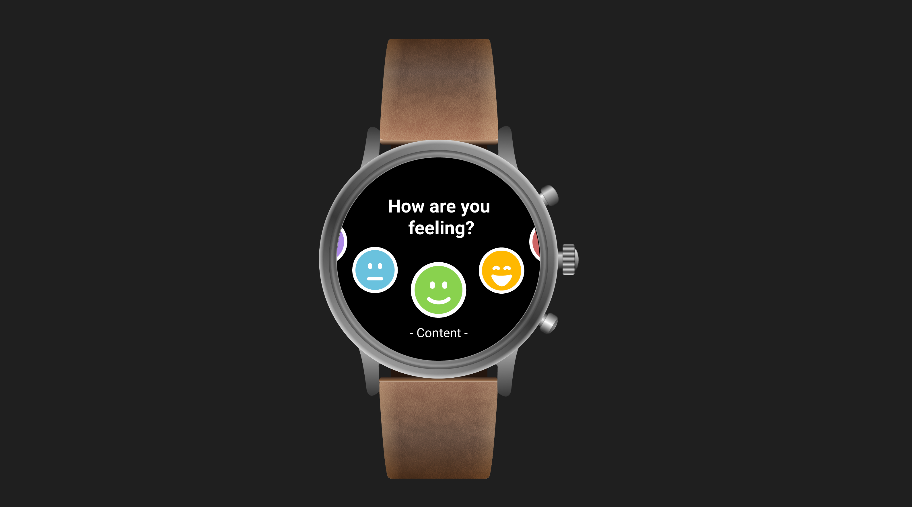
Wellbeing Tracker, a WearOS smartwatch application for monitoring mood, medication, and breaks. The aim is to develop habitual behaviour that encourages mindfulness of personal wellbeing.
Design Process
Wireframing and User Flows
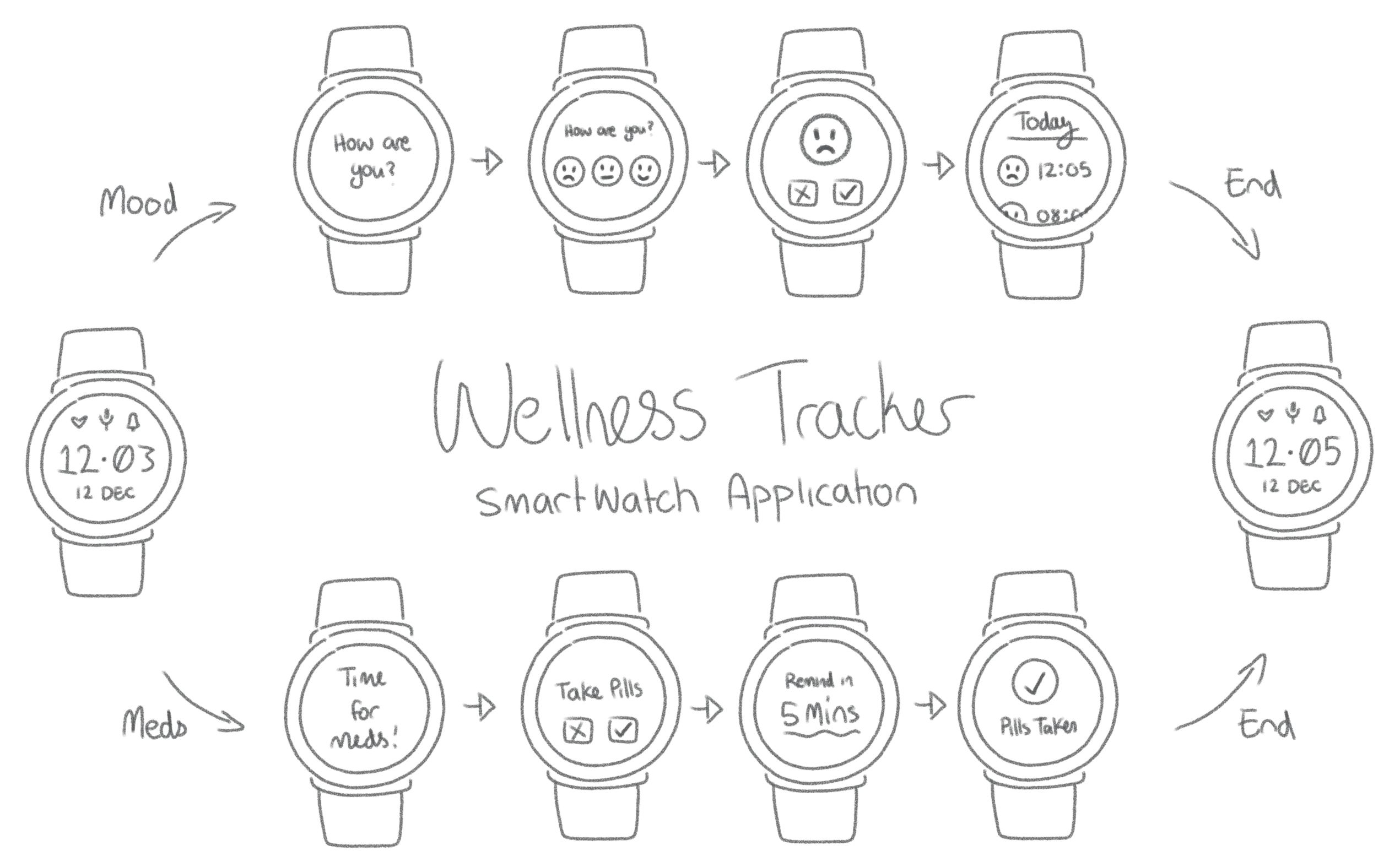
With my vision outlined, I started with a concept and pencil. I sketched out very basic flows using the minimal screen space available on a wearable device.
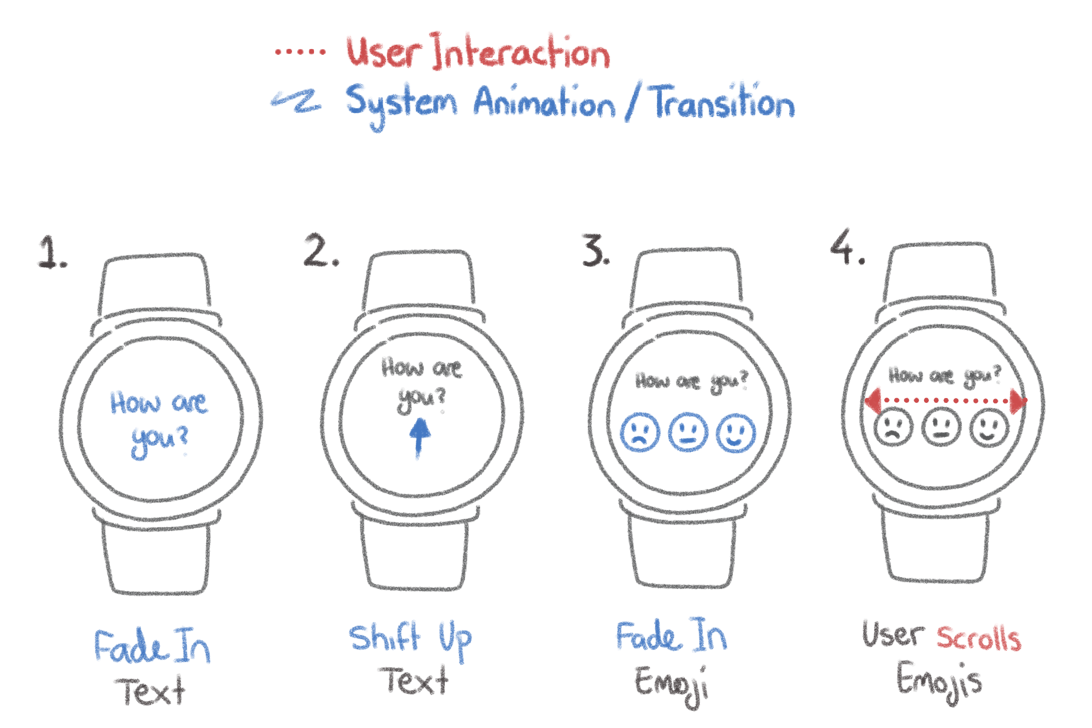
Inspired by these sketches, I took the user flow a step further - considering interactions and miro-interactions, animations and transitions, and built these into the flow.
Asset Development
My first task was creating a smartwatch mockup in Figma, I decided to do this myself from scratch to develop my skills. I used a real photo of a current generation smartwatch, the Fossil Gen 5 Carlyle as my base. Using vector shapes and strategic directional gradients I created a highly realistic smartwatch shape for my prototype.
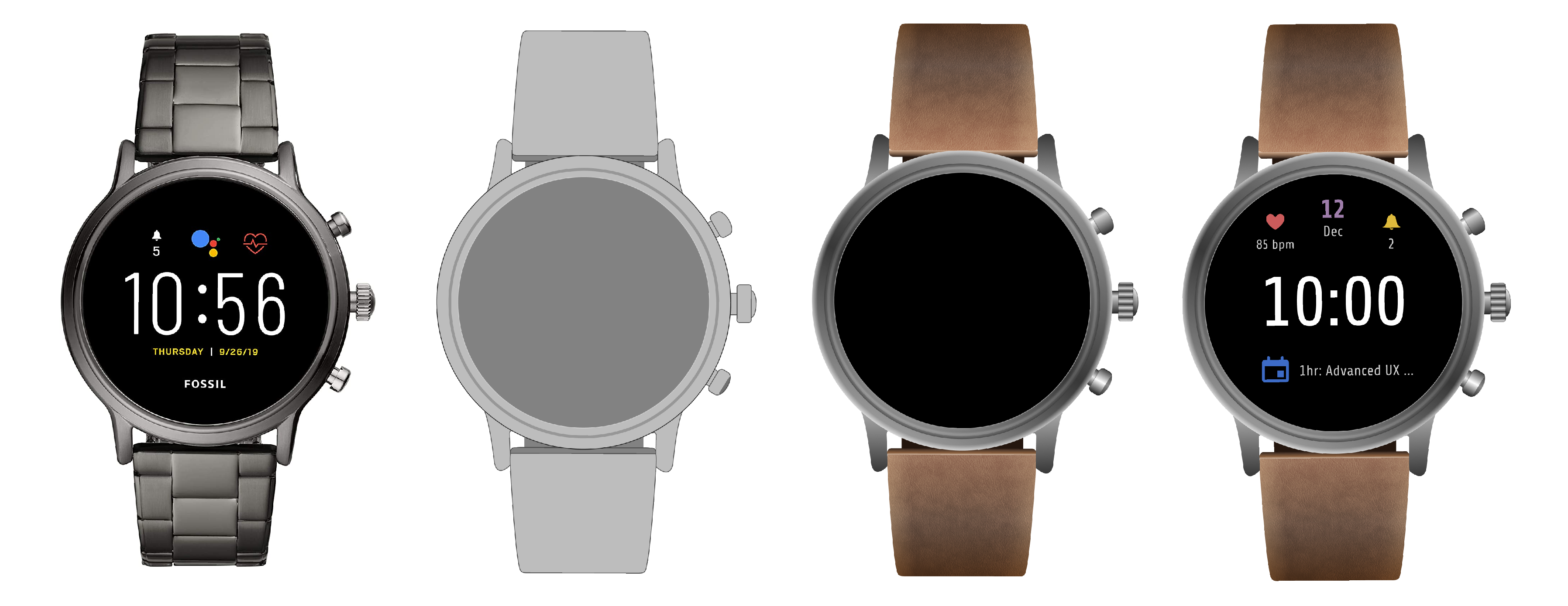
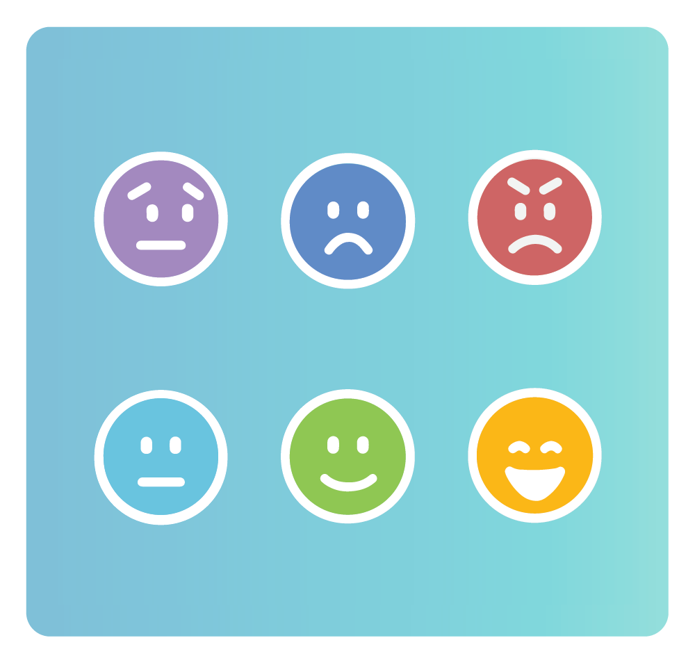
The other major component were the mood tracker SVG Emojis. These were created using Figma and Adobe Illustrator. In total six emojis were created: Anxious, Sad, Angry, Neutral, Content, and Elated. These were developed using emotive colour and commonly understood 'smiley' mapping to connect the emotion to each image.
UI Design
The UI was designed carefully using 8 Interaction Principles:
- Consistency - in style, button placement, terminology, and functionality.
- Constraints - highly limited actions to simplify and streamline the user flow.
- Visibility - careful consideration of visual hierarchy, few items on screen at any given time.
- Conceptual Model - a mood tracker works like a diary, a medication tracker works like an alarm.
- Affordance - ways to interact with the app using voice and touchscreen.
- Signifiers - clues in the UI design that tell the user how to use tapping and swiping gestures to complete tasks.
- Feedback - communicates the results of user actions, usually in the form of confirmation dialogues and success messages.
- Mapping - giving meaning to symbols and imagery based on colour and shape, such as: the emojis, green tick confirm, red cross cancel, and blue rollback delay symbols.
High-Fidelity Prototypes
The user flows and assets were used as the basis for my high-fidelity prototypes.
User Testing
User testing was carried out with five participants. A real smartwatch device was used to introduce the WearOS platform and a tablet device was used to display the high-fidelity interactive prototype for testing. Users were asked to complete a range of tasks in order to discover the following:
Efficiency
How long does it take to complete each task? How many taps?
All participants found they were able to complete the flow of the mood monitor quickly and easily, in under 30 seconds. Some made comments on how easy and streamlined the process was.
Understandability
Does the user interpret the symbols and icons as intended?
Four of the five participants identified the emotion associated with each emojis as intended. The “anxious” face took longest to identify and participants more often used the word “worried.” One participant initially believed they were looking at a 1-5 scale rather than a range of different emotions.
Legibility
Is the user able to read text easily? Is the text size and contrast level sufficient?
Participants did not have trouble reading text, except for in one instance. When delaying a reminder, an informational screen would appear for 1.5 seconds before fading away. This proved to be too short a period to read text this size and internalise the message.
Accuracy
Are all the tappable icons large enough? Is there enough space between elements?
The tests were carried out with a tablet to enable touchscreen interactions. Every participant encountered problems with tap interactions not registering at least once during testing, but without clear pattern or cause. Given how often this type of issue also occurred when using a real, physical smartwatch during the pre-test onboarding, I hesitate to solely blame the prototype. More specific testing may be needed.
Learning & Insight
This project really focused on iterative design. I very much enjoyed the visible, data-driven progress over time and opportunity to discuss ways of improving the experience directly with users. The process of developing solid metrics and goals for user testing, designing tasks and measurable ways of obtaining relevant data, were incredibly valuable. As a result of testing, a version two was made incorporating feedback and learnings. Overall, participant feedback was very positive with minor but impactful changes suggested.